
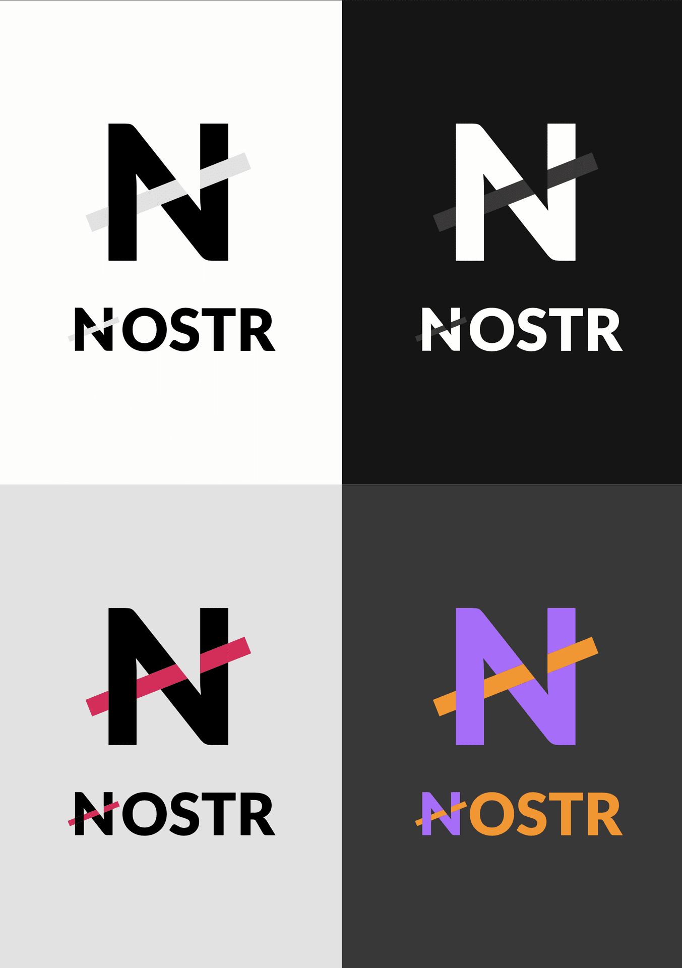
My motivation:
- Nostr already has a good "design" as a word; it is distinctive enough to be memorable and recognizable; we don't need to add images, so no ostrich;
- Focus on Nostr's main typographic reference, the first letter N.
- Give the idea of interconnectedness, but not neat and precise, something weird and cross-cutting, as per the Nostr style;
- Have something that is usable either as an icon (the simple N) or as a full name, in very different sizes and backgrounds, always with good readability;
- Choose something that works well with different colors, so that apps can customize and integrate it into their design giving room for creativity, but still be extremely recognizable;
quotingTHE LOGO
nevent1q…mn8t

I'm going to start promoting this because people keep asking for something that:
- is simple & recognisable
- literally anyone can draw in 3 seconds
- is NOT an ostrich
- shows that we're talking about a network
- fits nicely next to our competition's icons (Instagram, X, Facebook, YouTube, Google...)
- Pairs up well with the Bitcoin "B"
This logo has been doing the job for me for months and I still like it.
SVG files of several versions here 👉 https://w3.do/L6ZV6jBo
#nostrdesign #logo #branding
Sovereign Engineering (npub1s0v…rmq5)
zach (npub1zac…5dy5) hzrd149 (npub1ye5…knpr) franzap (npub1wf4…dgh9)
derGigi ⚡🧡 (npub1der…xzpc)