Tiro Typeworks on Nostr: nprofile1q…r9ng9 Classic example would be Frutiger’s original designs in which ...
nprofile1qy2hwumn8ghj7un9d3shjtnyd968gmewwp6kyqpqfhywkegwd6vccuetxrqze9vefd2th07yk57rwpva8avnl9knphcs3r9ng9 (nprofile…9ng9) Classic example would be Frutiger’s original designs in which the baseline stroke of the z sits slightly above the baseline for optical reasons. [In digital versions, this was normalised to sitting on the baseline, perhaps because of this issue?]
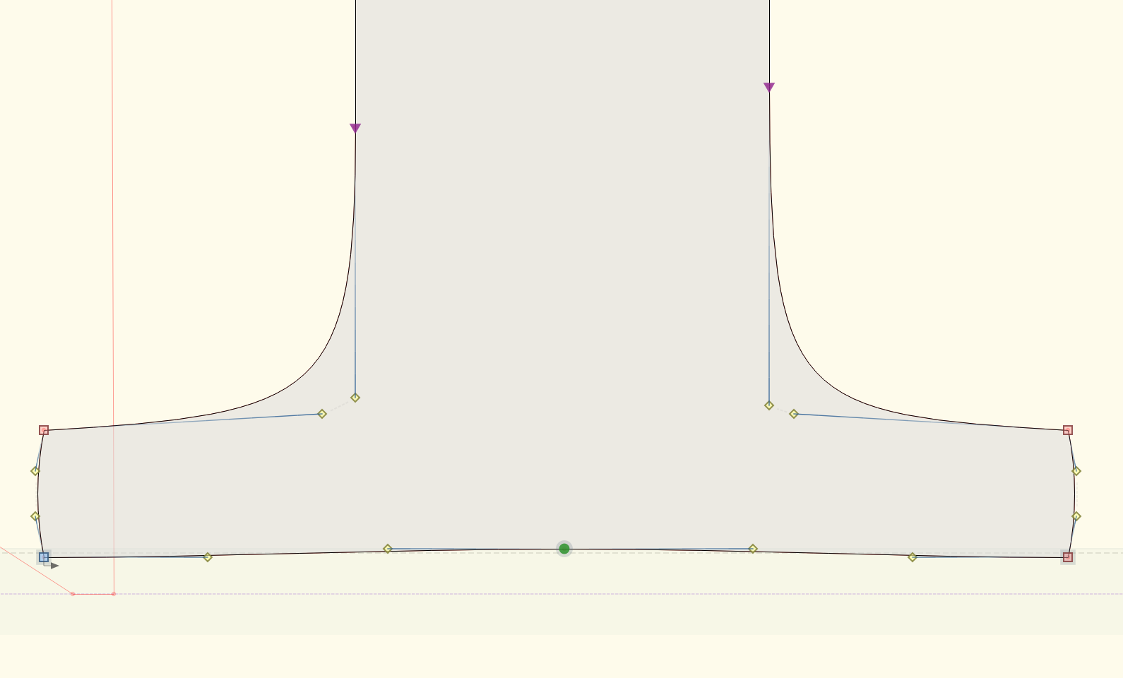
In my immediate case, there is a serif flex 2 units above the baseline., which is probably ignorable but intinctively I consider something that belongs within the baseline alignment zone.
I figure as long as the first blues pair is the baseline alignment zone, that should be defined as makes sense to the designer. Tools shouldn’t be inserting BluesValues not specified by the designer.